
Not the first ever Post-it stop motion but its one of the most creative i've seen
If you have a stop motion you like please comment a link.
Wednesday, 23 December 2009
Wednesday, 9 December 2009
Doom Poster billboard
Whilst Browsing the internet I found this amazing piece of street art

EDIT:

I saw these photos a while ago while I was researching street art, i love the clever use of tool-bars and HUD's postured onto existing billboards !
EDIT:
I saw these photos a while ago while I was researching street art, i love the clever use of tool-bars and HUD's postured onto existing billboards !
Saturday, 21 November 2009
Another set of Type posters
Some more posters from www.typographicposters.com
.jpg)
 This one made me laugh because its what I always say!


This one made me laugh because its what I always say!
Amazing Street art building animation
This is absolute Dedication! the amount of times the shadows shift this must have taken weeks to complete.
Friday, 20 November 2009
Type Posters picked off Deviantart
Thought I would include a couple of Typographic poster that stood out to me from the Design community Deviant-Art
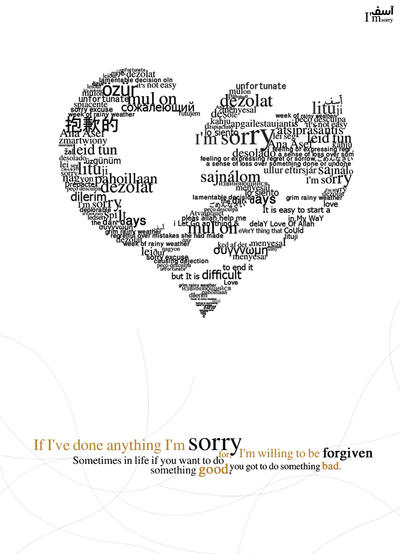
Titled 'asef .. I'm sorry.
This poster stood out to me because of the eroded heart shape the words were formed into.
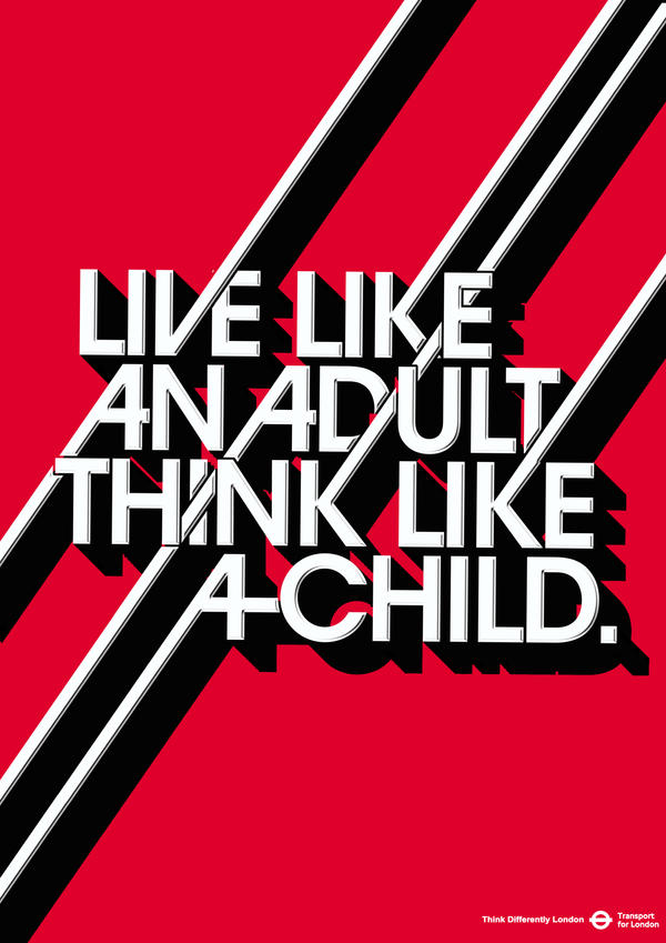
Titled Think Differently London 1. this poster was an ad campaign for London public transport to make you think differently. this poster grabbed my attention because it has a very blocky font yet has a definite feel of motion to it.
Titled 'asef .. I'm sorry.
This poster stood out to me because of the eroded heart shape the words were formed into.
Titled Think Differently London 1. this poster was an ad campaign for London public transport to make you think differently. this poster grabbed my attention because it has a very blocky font yet has a definite feel of motion to it.
Friday, 6 November 2009
More Type posters
I googled for clever typographic posters and it came back with this site. Most of the posters on there were good with a lot of Si-Scott styled work but one poster that stood out to me was this one;

it just appealed to me because its simple with a good effect.
I also saw this poster after clicking on more work by Craig Ward
, This poster is also interesting with an obvious view being conveyed in it.

it just appealed to me because its simple with a good effect.
I also saw this poster after clicking on more work by Craig Ward
, This poster is also interesting with an obvious view being conveyed in it.
Thursday, 5 November 2009
Motion Typography "kinetic Typography"
Something i saw a while ago was a video of the text from a song at the end of a game called portal. i thought this was clever back then and is related to type so here it is...
Also a related video I clicked on youtube of a "kinetic type animation" to a sound clip off pulp fiction one of my favourite films
Also a related video I clicked on youtube of a "kinetic type animation" to a sound clip off pulp fiction one of my favourite films
Akzidenz Grotesk
a brief history of Akzidenz Grotesk

The design of Akzidenz-Grotesk was theorized to be derived from Walbaum or Didot, as demonstrated by the similar font metrics when the serifs are removed.[2] However, the font family also included fonts made by other foundries, such as the c. 1880 typeface Royal Grotesk Light from the Berlin foundry Ferdinand Theinhardt Schriftgiesserei[3], designed by Ferdinand Theinhardt for the scientific publications of the Royal Prussian Academy of Sciences in Berlin. FTS also supplied the regular, medium and bold weights of the typeface. While Hermann Berthold took over Theinhardt's Berlin foundry in 1908, it wasn't until the fall of the Prussian monarchy in 1918 that Royal Grotesk was published as part of the Akzidenz-Grotesk font family and renamed Akzidenz-Grotesk Condensed.[4]- Quoted from Wikipedia
Contemporary versions of Akzidenz-Grotesk descend from a late-1950s project, directed by Günter Gerhard Lange at Berthold, to enlarge the typeface family, adding a larger character set, but retaining all of the idiosyncrasies of the 1898 face. Under the direction of Günter Gerhard Lange, he had designed 33 font styles to the Akzidenz-Grotesk family, including AG Extra (1958), AG Extra Bold (1966) and AG Super (1968), AG Super Italic (2001) and Extra Bold italic (2001).[5]
In May 2006, Berthold announced the release of Akzidenz-Grotesk in OpenType format, under the name Akzidenz-Grotesk Pro. The Pro family offers extended language support for Central European, Baltic and Turkish as well as Welsh, archaic Danish and Esperanto and is available in CFF PostScript OpenType. Berthold also released Akzidenz-Grotesk Standard, which includes glyphs of Western European character set, in both PostScript and TrueType flavored OpenType.[6]
In May 2007 Berthold announced the release of Akzidenz-Grotesk Pro+, which includes Cyrillic and Greek characters.[7]
Wednesday, 4 November 2009
Type posters from typographicposters.com
The site typographicposters.com has a wide variety of typographic posters funnily enough, this is a great source for inspiration and research on typographic posters.
here are a few of my favourites picked from the site;


These posters catch my interest because the designer overlays the coloured type of the names of the months over black and white photography.

These poster prints caught my attention because of the way the type is displayed in both positive and cut-out negative over the spade Symbol, It seems theses posters were created by a lino print or something similar.

The poster appeals to me because it contains an image of settable letter blocks. this poster also contains directly design related elements such as the registration marks round the edge and the fact the text used is a Hex code.

The poster uses the Shadow off a cardboard cut-out to show the text "my fears" and some Ivy leaf decoration implying that it could be a shadow of a tombstone. Also shadows link in with the whole scary horror theme.

This poster cleverly uses a modified road sign to show a dug grave implying that if YOU drink drive you will end up in the grave. The simplicity of the whole poster makes it aesthetically pleasing.
here are a few of my favourites picked from the site;
These posters catch my interest because the designer overlays the coloured type of the names of the months over black and white photography.
These poster prints caught my attention because of the way the type is displayed in both positive and cut-out negative over the spade Symbol, It seems theses posters were created by a lino print or something similar.
The poster appeals to me because it contains an image of settable letter blocks. this poster also contains directly design related elements such as the registration marks round the edge and the fact the text used is a Hex code.
The poster uses the Shadow off a cardboard cut-out to show the text "my fears" and some Ivy leaf decoration implying that it could be a shadow of a tombstone. Also shadows link in with the whole scary horror theme.
This poster cleverly uses a modified road sign to show a dug grave implying that if YOU drink drive you will end up in the grave. The simplicity of the whole poster makes it aesthetically pleasing.
Subscribe to:
Posts (Atom)